Beyond the Bottle: Creating a Consistent Spirits Brand Across Every Packaging Touchpoint
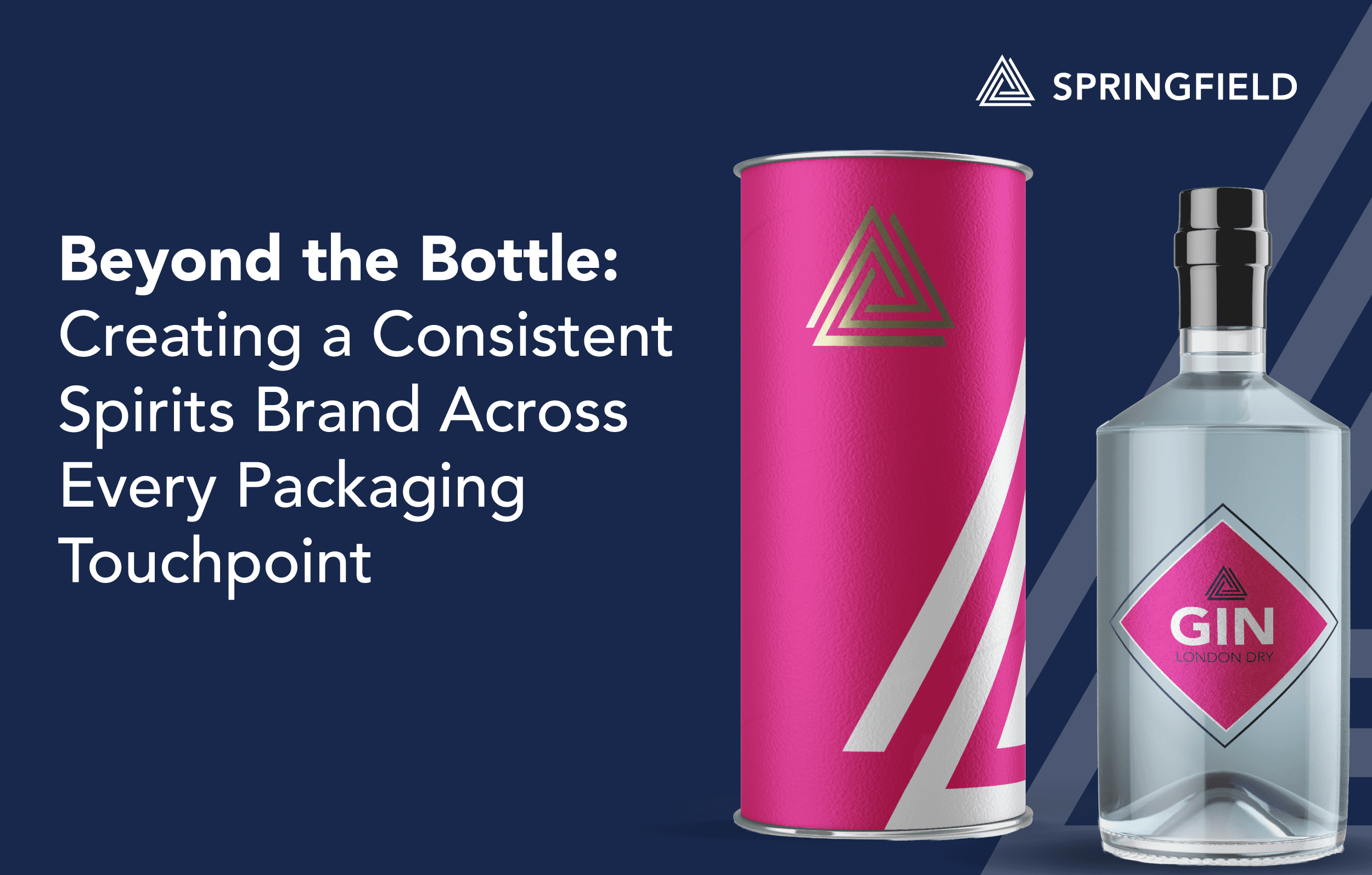
In the spirits industry, the bottle may be the hero, but it is not the whole story when it comes to packaging.
Today, a consumer might first discover a spirit brand through a paid social ad, compare it on an e-commerce product page, notice it on shelf through point-of-sale material, then receive it as a gift in a premium box or tube.
Every one of those moments shapes how the brand is understood, remembered and trusted. Which means when it comes to your packaging design, every touch point must be considered.
In this blog, we will discuss how to create and successfully execute consistent branding for your spirits packaging design, across every packaging touchpoint.
Why Spirits Brands Must Consider all Packaging Formats
For a spirits brand, packaging design should be considered as a complete ecosystem rather than a series of individual components. The bottle, label, carton, gift packaging and point-of-sale (POS) materials all contribute to how a product is perceived, how it performs at retail and how consistently the brand is represented across different consumer touchpoints.
Taking a joined-up approach from the beginning helps brands create packaging that looks cohesive, works commercially and delivers a stronger experience. Whether the product is displayed on a supermarket shelf, presented as a premium gift or featured in a bar.
The Benefits of a Consistent Approach to all Elements of Spirits Packaging Design
For spirits brands, bringing every packaging format into the development process early helps connect creative ambition with practical production requirements.
Consistent brand identity
By considering all packaging formats while at concept stage, you will ultimately arrive at a successful result where every packaging element feels like part of the same brand, with the same recognisable identity. This is particularly important when your brand offers multiple variants.
Strong shelf impact and higher perceived value
Spirits are often purchased for their visual appeal, gifting potential and perceived quality.
The relationship between bottle, label and outer packaging can help communicate this premium positioning, heritage, craftsmanship or a contemporary personality.
Finishes such as embossing, foiling, textured stocks and carefully considered structural design can reinforce that perception when used consistently.
Identifying technical challenges earlier
Another key benefit of a consistent approach across all packaging types when in design stage for spirits brands is being able to identify technical challenges earlier in the process.
Different formats introduce different production considerations. Labels need to suit the bottle’s shape and application requirements; cartons need to fit the product and protect it appropriately; and POS materials must meet structural, logistical and display requirements.
Considering these together from the outset helps teams identify constraints early, reduce redesign and avoid costly changes late in development.
Easier future product launches!
Consistency from the beginning essentially sets you up for success. A coordinated packaging system gives brands a stronger foundation for future variants, new sizes, limited editions and market adaptations.
Reusable design principles and well-managed artwork can help teams maintain consistency while making updates more efficiently across an expanding portfolio.
Designing Consistently for Different Channels – Physical and Digital
Spirits branding has always relied on atmosphere. Heritage cues, provenance, flavour, craft, quality and occasion all need to be communicated quickly. Traditionally, much of that work happened on the bottle label and outer packaging.
Now, the same brand world must also translate to retail displays, website banners, ecommerce images, social media posts, email campaigns, digital ads and trade presentations.
This shift means beverage packaging design has to be treated as part of a wider brand ecosystem.
A label may be the starting point, but the identity needs to be flexible to be applied to both physical and digital assets.
It has to work at the scale of a bottle neck tag, the structure of a gift carton, the impact of an in-store display and the cropped square of a social media feed.
If those touchpoints feel disconnected, the brand can quickly lose recognition and authority.
How to Create a Consistent Spirits Brand Across Every Packaging Touchpoint
Creating a consistent spirit brand starts with looking beyond the bottle.
From the label and outer carton to gift sets, point-of-sale displays and promotional materials, every packaging touchpoint should contribute to the same recognisable brand experience.
Start with a design system, not a single label
Effective spirits packaging design begins with a clear system. Before developing individual packaging components, define the visual elements that make your brand recognisable.
This includes the logo, typography, colour palettes, illustration style, photography direction, material cues, finishing details, iconography and tone of messaging.
For whisky brand packaging, that system may lean into provenance, craftsmanship, age statements and premium finishes. For gin packaging design, it may place more emphasis on botanicals, flavour cues, clarity, freshness and distinctive colour.
The important point for achieving consistency is that you should also consider how each design choice will translate across different materials and formats.
Adapting artwork and design across packaging formats
Brand consistency does not mean copying the same artwork onto every surface. It means adapting the identity intelligently, so it works strategically for each format.
The technical label requirements of a wraparound bottle label differ from those for a rigid gift box, a carton sleeve or a shelf-ready pack. Print areas, dielines, substrate choices, finishing methods and viewing angles all affect how the design should be applied.
For example, a bottle label may need fine detail for close-up inspection, while a gift carton must create impact from further away. A neck tag may need to simplify the message into a single claim or occasion prompt. A case card or retail display may need larger brand blocking, stronger contrast and a clearer call to action.
Point-of-sale is often where brand consistency is tested most visibly. In a busy retail environment, spirits brands have only a short window to attract attention and communicate value.
Artwork adaptation across all formats is so important. By understanding how packaging design moves from bottle to box to display, Springfield can help brands retain the recognisable assets that make them distinctive while adjusting layout, hierarchy and messaging for the specific touchpoint.
Test designs across all touchpoints before production
Packaging can look very different on screen compared with the finished product. Glass colour, label substrates, print processes, lighting and surface finishes can all influence the final appearance.
Production accurate packaging prototypes help teams evaluate how packaging components work together before committing to full production. Prototypes allow brands to assess materials, finishes, structural details and shelf presence.
3D visualisations also help stakeholders review concepts and compare variants earlier in the development process.
Testing across formats also helps identify inconsistencies or technical issues before they lead to expensive revisions.
Turning Spirits Packaging Artwork into a Library of Digital Marketing Assets
Once the core packaging artwork is approved, it should not sit in a folder waiting for print. It can become the basis for a valuable library of digital marketing assets.
This approach helps brands achieve consistency at scale. Instead of creating each campaign from scratch, marketers can draw from an approved system of assets that already reflects your brand identity. It also reduces the risk of off-brand creative being produced under pressure, particularly when multiple teams, agencies or retail partners are involved.
Springfield support this by turning packaging artwork into a wider suite of marketing-ready assets including:
- 3D packshots
- Animations
- Product catalogues
- Social media content
The result is a more synergised brand presence, both physically and digitally.
Beyond the Bottle, Every Touchpoint Counts
Spirits packaging design is the starting point for a connected brand experience. One that spans physical retail, gifting, e-commerce and digital marketing consistently.
Whether you are developing whisky brand packaging, gin packaging design or a broader beverage packaging design system, the goal should be the same. Create a distinctive identity that remains consistent, recognisable and effective wherever the customer encounters it.
By building from strong packaging artwork and applying it thoughtfully across labels, cartons, POS, 3D packshots and digital marketing assets, spirits brands can create a more unified presence. As well as a stronger platform for growth.
Beyond the bottle, every detail is an opportunity to reinforce your brand!