Achieving Colour Accuracy on Metallised Substrates with Packaging Mock-Ups for DaBelle

When launching a new product variant, colour is not just a design choice – it is a commercial decision. Get it right, and your brand captures attention at the shelf. Get it wrong, and you risk blending into the visual noise.
In this case study, discover how DaBelle partnered with our Springfield team in São Paulo to overcome the challenges of colour accuracy on metallised lens substrates for their Hair Intense range.
For DaBelle, introducing a new variant to the Hair Intense portfolio with the cherry scent was a strategic move, but also brought to the table new challenges in achieving shelf differentiation.
Through collaborative development and the use of advanced packaging mock-ups, we delivered a standout, market-ready result.
The Challenge: Colour Accuracy on Complex Materials
DaBelle aimed to expand its product line with a bold, cherry-inspired variant designed to stand out at the point of sale. The goal was to create a distinctive tone that enhanced brand identity while avoiding confusion with other products on the market.
However, the use of metallised substrates with lens effects introduced a critical challenge. Colours printed on these materials behave very differently compared to standard substrates, making traditional Pantone references unreliable.
Achieving consistent colour accuracy in this environment required more than specification, it required expertise, testing, and real-world validation.
The Approach: Collaborative Development with Packaging Mock-Ups
Springfield approached the project as a strategic partner, combining creative consulting, technical knowledge, and hands-on collaboration.
Over two intensive days, our design team worked closely with the customer to:
- Develop multiple colour variations
- Test outcomes directly on the metallised lens substrate
- Refine tones through iterative sampling
- Compare results in real-world conditions
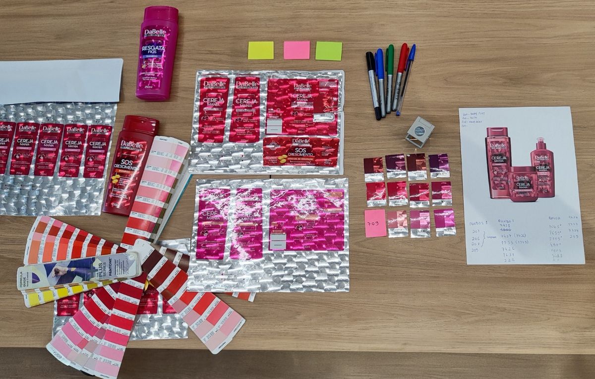
This co-creation process, supported by rapid packaging mock-ups, allowed for immediate feedback and confident decision-making.
“Printed samples are fundamental in the product development process because, by seeing the chosen Pantone color on the substrate (whether transparent or metallic), we can visualize how the color behaves on the real material, which can result in a completely different appearance from what we see on the screen.” Vanessa Kreischer- DaBelle
The Solution: Prototyping for Precision and Confidence
Once the ideal colour was achieved, Springfield produced high-quality packaging mock-ups across multiple SKUs in the range.
These prototypes enabled:
- Accurate visualisation of the full product line
- High-quality photography for pre-launch marketing
- Faster internal approvals and stakeholder alignment
By bridging the gap between concept and production, Springfield ensured complete confidence before scaling.
The Result: A Successful Launch with Measurable Impact for DaBelle
Following approval, the project transitioned smoothly into full production at All4Labels’ Blumenau site.
The outcome included:
- A fully refreshed and visually impactful product collection
- A successful product launch with strong market reception
- Positive customer feedback on both quality and process.
Why Springfield?
Springfield helps brands reduce risk, improve speed to market, and achieve precision in packaging development through:
- Advanced packaging mock-ups
- Expertise in colour accuracy across complex substrates
- End-to-end artwork and asset management
- Collaborative, insight-led development processes
Ready to take control of your packaging outcomes? Contact the team elevate your next project!

